Why Apple Flipped Its Logo - and When Social Proof Fails
Apple’s upside-down laptop logo reveals how observability, social proof, and thoughtful product design can turn ordinary use into visible growth.
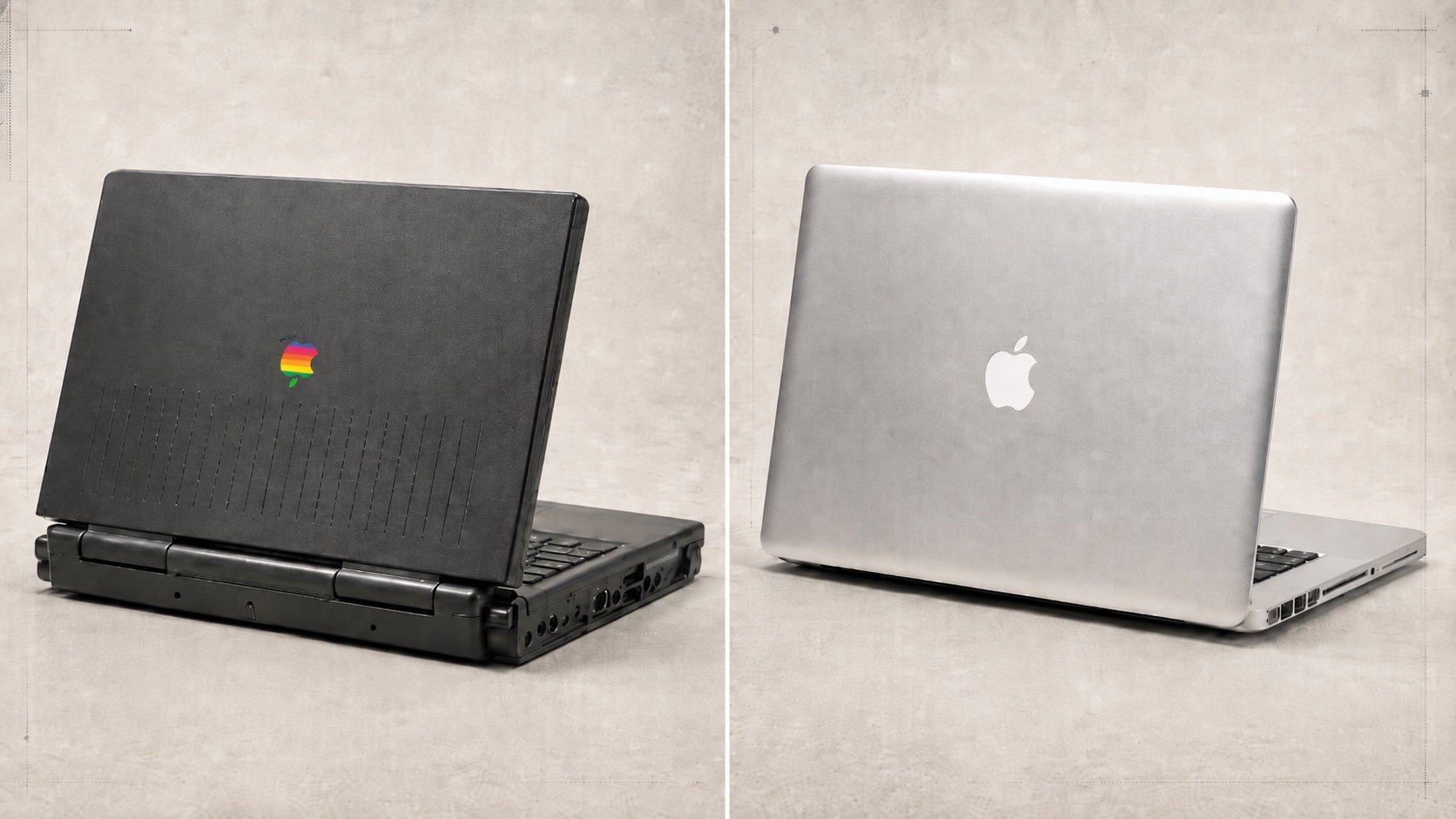
Apple once made its laptop logo look correct when the computer was closed—and upside down whenever the product was actually being used.
That was not a careless mistake. It was a deliberate attempt to help owners orient the laptop before opening it. But the solution created a larger problem: the user saw the logo for seconds, while everyone else could see it for hours.
The eventual flip reveals a powerful product principle: visible behavior can become distribution. When people can recognize a product in use, every user can become a signal that helps the product travel.
Watch our TikTok Slides for this topic Why Apple’s laptop logo appeared upside down
On early PowerBooks and iBooks, the Apple logo faced the owner when the closed laptop sat in front of them. The mark acted like a small compass: if the Apple was upright, the user knew which edge to lift.
The trade-off appeared as soon as the screen opened. The logo rotated with the lid and looked upside down to everyone across the table, inside a coffee shop, or watching an Apple laptop in a film.
According to an account by former Apple employee Joe Moreno, Apple’s design group had debated both orientations. Steve Jobs initially prioritized the owner’s opening experience. Apple employees later challenged the decision, and the company reversed it.
The reasoning was beautifully simple: opening a laptop from the wrong edge is a brief, self-correcting mistake. An upside-down logo remains wrong for the entire time the laptop is open.
Two audiences were looking at the same object, but one audience saw it for much longer.
Apple’s dilemma is a clean example of how small design choices can change how people experience and value a product.
The bigger lesson was observability
Marketing professor Jonah Berger later used the Apple story to explain “public,” one of the principles in his book Contagious. His compact version of the idea is memorable:
If something is built to show, it’s built to grow.
The point is not that a visible logo automatically causes a sale. It is that people cannot copy behavior they cannot observe. This is a form of social proof: visible behavior helps define what feels normal or desirable.
An open laptop with a recognizable mark makes three things easier:
- Recognition: observers can identify what someone is using.
- Imitation: the product becomes an available option when observers make their own choice.
- Conversation: a visible cue gives people something concrete to ask about or remember.
This belongs to a broader psychology of why people share and spread things. Some information travels because it is useful, some because it creates emotion, and some products spread because their use is publicly visible.
The logo flip made every public use of the laptop more legible. A person working in a café was no longer merely using a computer; they were visibly using an Apple computer.
That is the marketing interpretation behind the carousel line “Every open laptop became an Apple ad.” It is a useful mental model, not a documented statement from Jobs or evidence that the logo change alone caused Apple’s growth.
How products can make useful behavior visible
Observability is especially valuable when a product’s benefit is normally private.
A bicycle is naturally public. A budgeting system, study routine, or note-taking workflow is not. Other people may see the outcome without seeing the tool or behavior that produced it.
Product designers can bridge that gap by creating a visible artifact of genuine value:
- a finished design that carries a recognizable signature;
- a shareable flashcard with its source and explanation attached;
- a collaborative study set that shows how knowledge is organized;
- a progress summary that represents real practice rather than an empty streak;
- a useful output that naturally travels beyond the original user.
The strongest visible features are not decorative badges pasted onto a private experience. They are evidence of the value the product already created.
Good observability makes value visible. Bad observability makes popularity visible without explaining it.
That difference matters because people do not only notice others’ behavior. They also interpret it.
Social proof is useful only when the signal fits the decision
Following other people is not automatically irrational. When information is scarce, their behavior can be a useful shortcut.
A crowded restaurant may indicate good food. A widely used tool may have strong support and a healthy community. A recommendation from someone with the same problem may reduce search costs.
The shortcut becomes unreliable when hidden context changes the meaning of each choice.
A course with many enrollments may have strong marketing but poor completion. A trending book may be highly visible without being useful to a particular reader. A learning app with a large streak count may reward opening the app rather than remembering anything.
The visible number is real. The conclusion drawn from it may not be.
Before trusting social proof, ask:
- Were the earlier decision-makers solving the same problem I am?
- Did they have information I do not have—or constraints that do not apply to me?
- Does the signal measure value, popularity, or merely exposure?
- Can I inspect the reasons behind the choices?
- Is there independent evidence I can use instead?
These questions turn imitation into informed judgment.
Design observable proof, not empty popularity
The Apple story points to one durable principle: visibility changes behavior.
For a product you want people to discover, make real value easier to observe. Give useful outputs a recognizable form. Let satisfied users share what they made or learned. Design the public state of the product as carefully as the private one.
When the decision is sensitive or high-stakes, add context to the social signal. Explain why something was selected or rejected. Show relevant differences between users. Pair popularity with quality measures, sources, and limitations. Make it possible to evaluate the evidence without following the crowd.
The goal is not maximum visibility at any cost. It is legible value.
Apple’s old logo optimized a few private seconds. Flipping it optimized hours of public exposure. That made the product easier to notice and remember.
The boundary is equally important: what people can see influences what they do, even when the most visible signal is not the most useful one.
If something is built to show, it can be built to grow. If a signal is built without context, it can also mislead.
Sources and further reading
- Former Apple Employee Explains Origins of Upside-Down Logo, Christina Bonnington, WIRED
- Q&A with Jonah Berger, Penn Today
- Contagious: Why Things Catch On, Jonah Berger